Intimidated by the title? Don’t worry, this entire section is a “reference-tutorial” which will show you the how and why of these powerful capabilities, step-by-step. More importantly you’ll come to understand why and when you want to do this so you can take advantage of all ReadWrite Digital Analytics has to offer. As you work through, remember to save your work to a favorite so you can always pick up where you left off.
In this section
Group, pivot, chart
Summarize data with groups and charts
Add more context with pivots
Tell a story with charts
Reasons to use group, pivot and chart
Trend analysis and group level comparisons are great reasons to dive into group, pivot, and chart functions. There is no limit to the number of questions you can answer, but here are just a few samples:
- What are our attendance rates by grade, race, and ethnic group?
- How proficient are my 3rd graders in reading by race and ethnicity?
- How has that proficiency changed over time?
- What kind of growth do my ELL students experience on state assessments by school or by teacher?
- How are grades and attendance rates correlated?
- How do students perform relative to one another on state summative, interim or formative assessments by race, ethnicity, economic status, English learner status, or learning disability?
Do more with your data
In the working with data views section, you learned how to customize the standard types of data views supplied with Analytics into even more impactful insights about your students and schools. Here you will learn how to create data from data by creating summations with groups, breakdowns with pivots, and illustrations through charts.

If you are already a spreadsheet pro and know how to do this sort of stuff with Microsoft Excel or Google Sheets, then you will find the functions in Analytics to be familiar. Just click the chart button in any data view (or student profile), and you’re off…

If you are like most of us, and this topic is a big unknown, read on…
Where do I start?
Have you ever attempted charting and pivoting with a spreadsheet and found more questions than answers? That’s because figuring out how to start is often its own hurdle. The dirty little secret of all data analysis work is a thing called data prep.
Because the data prep has been taken care of, you will find getting started with groups, pivots, and charts in Analytics is actually quite easy, especially if you’ve ever tried to do it in a spreadsheet program. Why? Because that data prep is not just about sourcing the data, it’s about getting data in a way that you can manipulate it, understanding what it means, and finally knowing how to format that data to be suitable for the stuff you want to do. The good news is Analytics takes care of the “getting” and “formatting” parts. Being an educator, we’re betting you understand the data. Now look, you’re already halfway there. So what are you waiting for? Click that chart button.

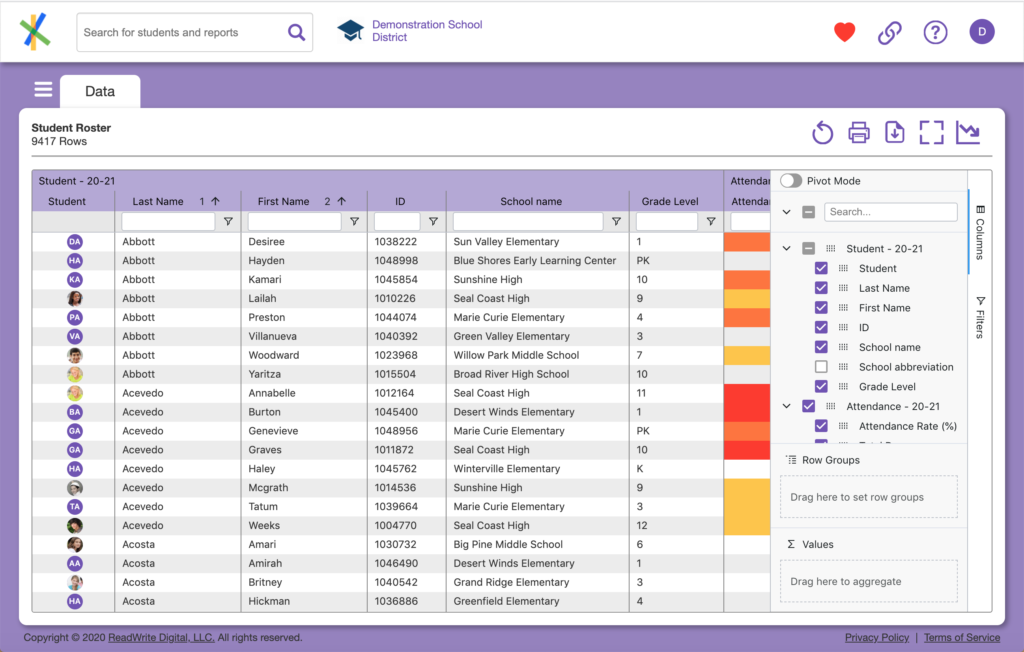
Remember the chart button? You will see it now looks like this which means you are in “group & chart mode” and if you click it again, you will exit that mode and the side panel (with the Pivot Mode toggle at the top) will disappear.
A note about data structure
Remember the data formatting discussion above? When we talk about formatting data for purposes of aggregation and charting, one important aspect of that is data structure which is to say how the data is laid out in rows and columns. When it comes to manipulating data, structure matters. Your organization may have alternative data structures available for certain data views. These structures will lend themselves to different ways of working with the data. For the purposes of this guide, we will work with the default data structure which is the way it is typically presented in standard data views users find easy to understand. The concepts discussed in this section are applicable to your data views in general, regardless of their data structure.