Want to tell a story with your data? Group and aggregation are great ways do this and usually required for effective charting. So if you think you want to chart some data, spend a little time here to become comfortable with setting up groups. Of course, grouped data alone has value, whether you end up charting it or not. This page is organized as a “reference-tutorial” which will show you the how and why of groups, step-by-step. As you work through, remember to save your work to a favorite so you can always pick up where you left off.
In this section
- Group, pivot, chart
- Summarize data with groups and charts
- Add more context with pivots
- Tell a story with your charts
Getting started with groups
By now you’ve clicked the chart button and have entered “group & chart mode”. If not, do so now. You should see a screen similar to this:
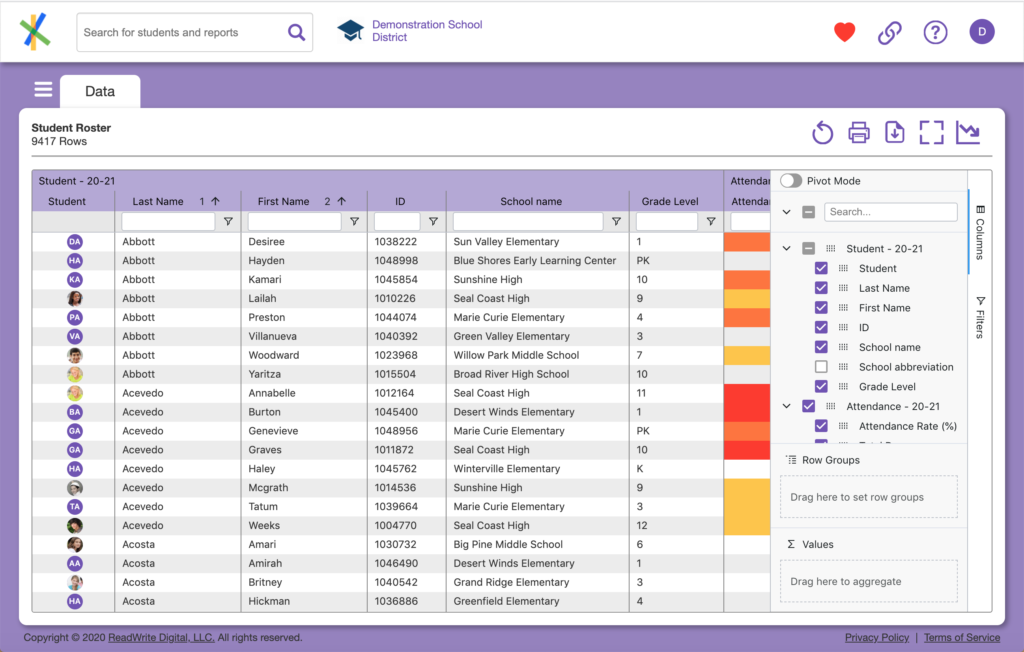
Here we’ve entered chart mode from the Student Roster. You can see the big difference from your normal data views is the tool panel on the right side of the data grid with the Pivot Mode toggle at the top. This tool panel gives you access to controls that allow you to manipulate the data in the grid. This includes show/hide of columns, creation of groups, calculations and filtering. The column and filtering controls work similar to what you’ve already seen when working with data views except they show up here to allow modification of the data view, even when there are no columns visible. If the tool panel is new to you, check out the section below for a deeper dive. Otherwise, skip ahead to the next section.
All about the grouping tool panel
The tool panel which appears in group and chart mode has a lot going on. Here we break it down for you:

- Pivot Mode toggle. Clicking on this toggle will add a Column Labels section to the bottom of the panel to allow for subgroup aggregations. More on this later.
- Column search and show. Whatever you do here effects the display of the list of columns below:
- Click the downward chevron
to collapse the list of columns below into their “block level” headers for high-level browsing.
- Click the checkbox
to quickly show / hide all columns in the data grid.
- Type in the search box
to find a particular column in the list of columns below. Like so…
- Click the downward chevron
- Column display control. Click on a checkbox to show/hide individual columns in the data grid or grab a column with it’s drag control
to drag it to Row Groups or Values box below.
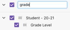
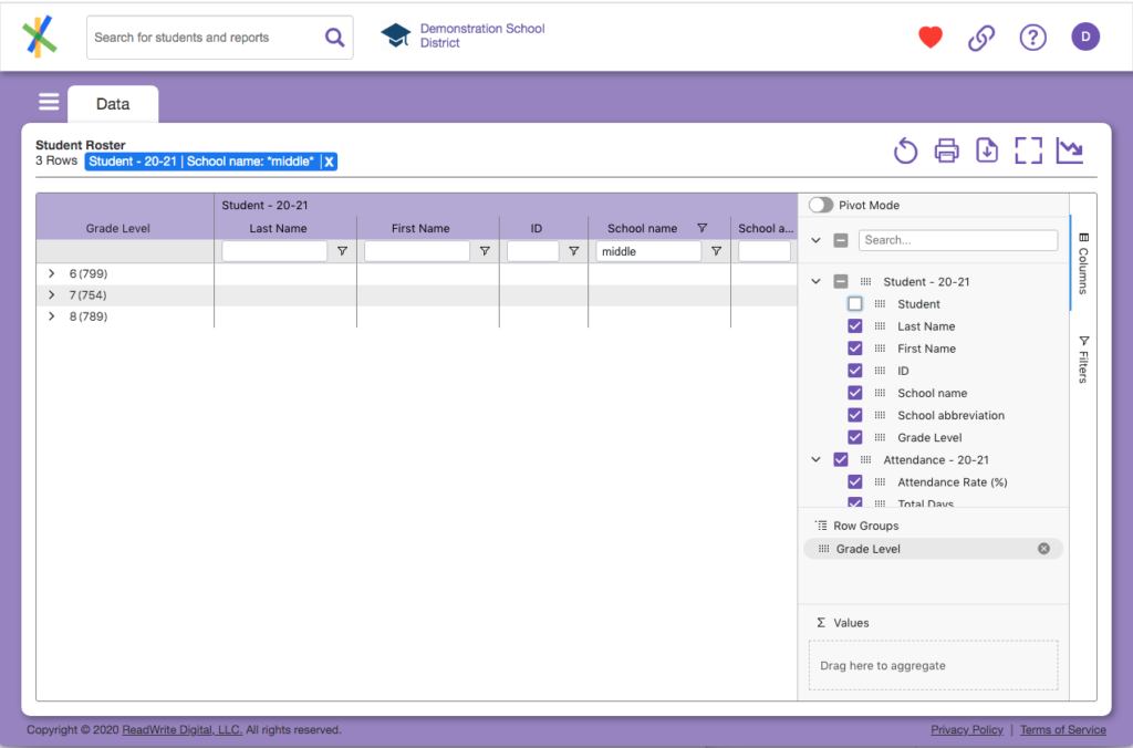
- Row Groups. Grab a single column from the column list by it’s drag control (mentioned above) and drag and drop it into this box. You can try this with something simple like Grade Level. Instantly the data grid will update thus:
- A new column will appear on the left-hand side of the grid
- The column will include one row for every discreet value found in that column
- If you have not defined any aggregations, all data in the grid will disappear
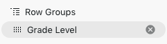
- The column header will be listed in Row Groups like you see below. Click the “x” to the right of the column you dragged in to remove it from Row Groups for now. We’ll deep dive on grouping in a bit.:
- Values. Like Row Groups you drag columns from the column list into this box. But your goal here is to aggregate data as label in the box suggests. Like groups, we’ll deep dive on this in a bit.
- Columns. Click to hide the tool panel. Click it again to show it with columns.
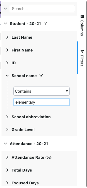
- Filters. Click to show the filters available for every column. Click again to hide the tool panel. Since every column in Analytics can be filtered, every column is listed here. Filtering a column here will display a filter bubble just above the data grid as you have seen when working with data views. The Column search and show controls (described in #2 above) you see here on top work just like they do for the list of columns. Importantly, you don’t always need to filter from here, you can still use the filters in the column headers. The filters are available here for convenience or when there are no columns listed in the grid but you still want to filter.
As you can see, there is a lot of stuff packed into the grouping tool panel. Actions like selecting, dragging and dropping fields may seem intimidating at first. Don’t worry, you’ll get it.
Here are few tips to make it all easier:
- Try a mouse. If you are having trouble with drag-and-drop fields using a trackpad on a laptop, maybe using a mouse will help.
- Use a big screen. If you’re building a report, you’re creating content. Big screens are much more suited to content creation. If you use a laptop, try plugging an external screen in. Trust me.
- Maximize your tool panel space. Here are 3 things you can do to give you the most space for working with the tool panel.
- Expand the panel horizontally. Hover your mouse over the left edge of the tool panel. It turns into an expansion control. Click and drag the left edge of the tool panel further into the grid as far as you like.
- Expand the tool panel vertically by clicking the grid maximize button
- Expand the tool panel vertically even more by maximizing the window of your web browser.
- Smile
because now you’re cooking with gas.
Your first group
Wait one second! Are you familiar with the grouping tool panel? If so read on! If not, we suggest you take a look at the section above because everything after this assumes you know what’s going on in that panel.
Returning back our data, you should be in “group & chart mode” and your screen should look something like our Student Roster below. If you don’t see something like this, go ahead and select Student Roster from the data view menu and click that chart button. You should see this:
You group data when you are interested in a summary, not detail. Analytics presents you with the detail by default. Why? Because the goal is to help students and a student is not a summary! That said, looking at groups of students or, aggregations, and understanding how those students are faring as a group is important for all sorts of reasons. Generally, we are looking to answer a question, or several questions. See some sample questions under Group, pivot, chart for a few ideas.
Let’s give it a try
This section is going to guide us through the mechanics of answering that first question by grouping:
What are our attendance rates by grade, race, and ethnic group?
Step by step:
- First note there are 4 pieces of information sought in this question: attendance rate, grade, race, ethnicity. One might say there are “4 categories of data” in the question.
- You may be shocked to learn that the Student Roster turns out to be an ideal starting point for this question. Why? Because it includes detail on all 4 categories of data in the question. When you have a well-formed question, it should be rich enough to tell you the types of data you need to answer the question. With a well-formed question in hand if you are still wondering what types of data you have to answer the question, click on the data view menu to see a list of what’s available. This should give you some ideas of the view that will provide the best data to answer the question.
- In the tool panel, find the Grade Level column and drag it to Row Groups. You should see something like this.
- Note we have also placed a filter on school so we are only looking at our Middle school kids. If you are working at the school level, it is likely you will only see students in your school as well. The point is we can filter and group on any data while working in groups.
- Like the screenshot, you should see a Grade Level column on the left of the grid which now has just 3 rows, one for each middle school grade level and there is no data. Further, if you scroll the grid to the left, you’ll see another Grade Level column. What’s going on? Let’s break it down:
- The first Grade Level column (on the far left side) is a synthetic column created by Analytics to hold your group-level aggregations. Every time you add a column to Row Groups, a new synthetic column will be created which includes a row for every distinct data element for that column. The other grade level column is the actual grade level you normally see in data views.
- In that first Grade Level column, for each row we see a chevron, the actual grade level, and a larger number in parenthesis.
- Click a chevron and you’ll see data in the grid again. This is the detail that makes up the group and the number in parenthesis is the count of rows within that group.
- Click the chevron again to close the group. It’s worth noting, you can have more than one group defined and Analytics will nest those groups in the order you place them in the Row Groups box. But we’ll leave it at that for now.
- By this point, you probably have surmised a thing about grouping. It only makes sense to group on a finite, and relatively small data set. By relatively small, it could still be dozens of rows or even a hundred or so. For example, if you have 100 schools in your district and want to see aggregations by school, grouping by school still makes sense. Whatever column you are grouping by, the data needs to “make sense” as a group for the purpose of your analysis. For example, you would, in most cases, not group by a field like student number. But there are situations you might consider doing so. For example, a data view of scores where each student has many rows with one for each score. As a side note, the term for this is cardinality. A column with a lot of repeated values, like school or grade, has a low cardinality while a column with many distinct values, like student number has a high cardinality. You typically group on columns with low cardinality.
- Let’s do a little cleanup. Click the Column search and show checkbox twice in the tool panel. (Don’t know what that is? Review the earlier section called All about the grouping tool panel). All of the columns disappear with the exception of the synthetic Grade Level column. If you click that same checkbox again, they all reappear. When working with your data like this, it’s generally easier to remove what you don’t need to see, and then add in the few things you do want. You’re trying to tell a story, and it should be easy to follow.
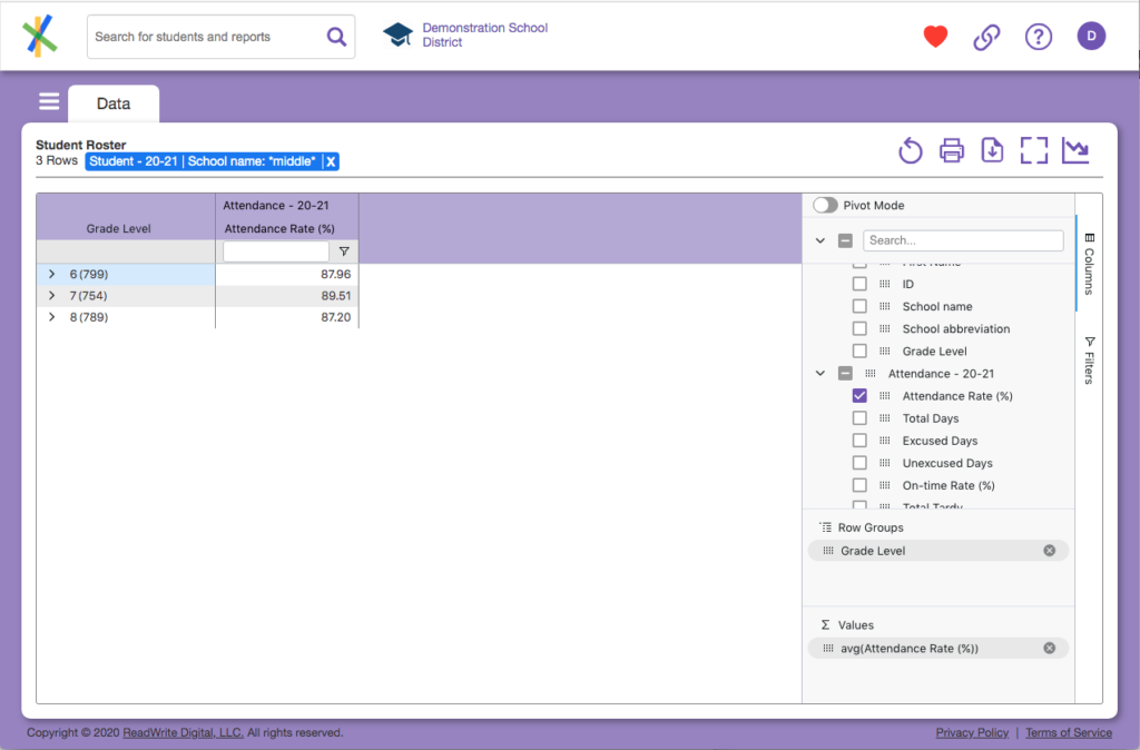
- Click on the checkbox next to your most recent Attendance Rate (%). In our example, that would be just under Attendance – 20-21 in the tool panel. That column will appear in the grid.
- Drag that column to the Values box in the tool panel. You’ll see some very large numbers in the Attendance column. That can’t be right! It’s not. If you look closely at the values box you’ll see sum(Attendance Rate (%)).
- Anything you drag into Values will be aggregated at each group level. So in our example we are summing the attendance rate for kids in 6, 7, and 8th grades.
- Click on the Attendance Rate summation in the Values box. A popup menu with different aggregation functions will display. Scroll through them until you see avg. You should see the following:
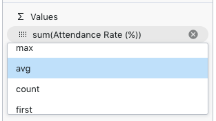
- Click avg. Your page should look similar to this:
- If what you see looks nothing like this, try to walk through the process again from the beginning. To do that, just select Student Roster from the data view menu and start again from the top of this page. Sometimes a little repetition helps.
Your first chart
Congratulations! You’ve created a grouped data view with an aggregation, you may want to save your work to a favorite. You can always delete it when you’re done. Before moving onto pivots, let’s create a chart.
- Select the data in the grid, just the data, not the column headers.
- With your mouse in the data grid, right click and you’ll see a menu pop-up.
- Select Chart Range > Column. You should see something like this:
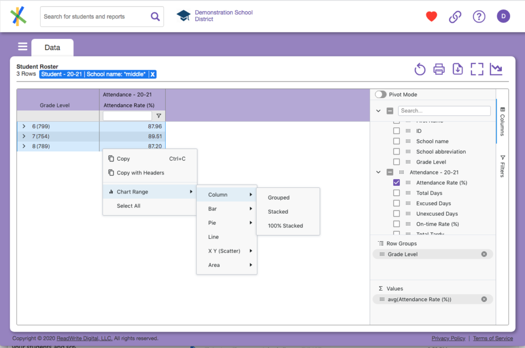
- Select the final menu item Grouped.
- You should see something like this:
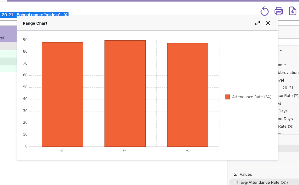
While nice, it really doesn’t tell you a whole lot except that, middle school kids, in aggregate, have similar attendance rates across grade levels. We will dive deeper into charting later on but feel free to mouse around and check out the functions available in the chart window. There’s plenty you can do. Once you’re done, close the chart.
Reflections on this section
Questions that deserve an answer. The question we have worked with is a good one for data analysis. It is well-formed. A more general form of this question is: “What’s my attendance like?” While not a bad question, it’s not very actionable and therefore not well-formed. The first goal is to make sure you are working with well-formed questions. Take the time to think about what you, or the person asking you, is really trying to figure out. Always remember, sometimes there is more than one answer or maybe there’s really more than one question. In any case don’t be afraid to experiment, create multiple views of the data, multiple groupings, multiple charts. Save what you want, trash the rest. It’s all good.
We kept it simple. Obviously, this is a very simple example. We’ll get a bit more complicated in the next section. As you experiment, you can add more columns to groups (making nested groups) and more columns to aggregate. It’s worth playing around a bit to see what produces results and what doesn’t. One thing about working with data is that the data only works in certain ways. For example, you don’t summarize letter grades, but you could count “A” grades, if that’s of value.
Term talk. Summarization, aggregation, dis-aggregation. These terms are often used interchangeably and this can lead to some confusion. Take for example a report which answers the question above with a count of our 3rd graders. Three different people might refer to the data found in the report using any of those 3 terms. But get this: all three would be correct! Like most things, perspective matters. Summarization and aggregation are synonymous in this context where the aggregation is a count of students in each subgroup. Note the aggregation could be any calculation: average, percentage, etc. The term is generic. When working in Analytics, we will often refer to grouped data as a summary or aggregation because we start with the detail data about each student. What if someone referred to the report as a dis-aggregation? That generally means they are coming from the perspective of less detail – maybe starting at the district, state or national level.
Previous: Group, pivot, chart