By now you know how to organize a standard data view into simple grouped data and even create a simple chart. If not, checkout Summarize data with groups and charts before diving into this section, because this one builds on that one. Here we’ll explore using pivots to add more categories of data and provide useful breakdowns of our grouped data. This page is organized as a “reference-tutorial” which will show you the how and why of groups, step-by-step. As you work through, remember to save your work to a favorite so you can always pick up where you left off.
In this section
- Group, pivot, chart
- Summarize data with groups and charts
- Add more context with pivots
- Tell a story with your charts
Getting started with pivots
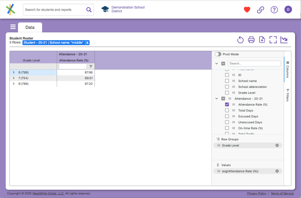
Make sure you’ve entered “chart mode” and created a simple grouping from student roster data similar to the section Summarize data with groups and charts. If not, do so now. You should see a screen similar to this:
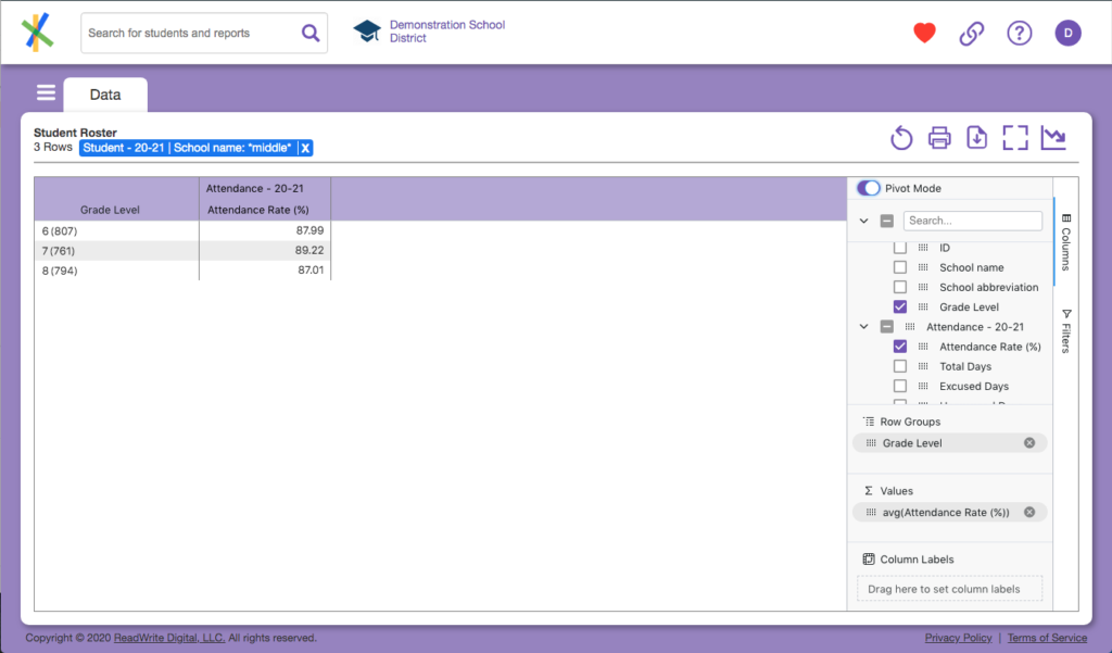
See the the Pivot Mode toggle at the top of the tool panel? Click it. You’ll see a few minor changes to the page. The “filter row” in the data disappears as do the group chevrons to the left of the grade levels in the synthetic column of grouped grade data. Additionally, Grade Level is checked in the tool panel and a new section called Column Labels appears at the bottom of the tool panel. Your page should look something like this:
Remember our question…
What are our attendance rates by grade, race, and ethnic group?
With our current grouping we have answered 2 of the 4 categories of data: attendance rates and grade. Lightning round! Is there a 5th category? In a sense, yes, because we have also filtered to see middle schools only. So we are really answering what our middle school attendance rates by grade, race and ethnic group are. So how do we add in the next category: race? One way would be to add another group for race, but if you guessed we are going to “pivot” on race, you are on the right track.
Adding pivot columns
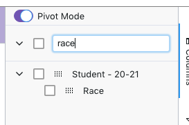
Pivot columns are those columns which appear in the Column Labels section of the tool panel. So we want to get the race column in there. In the tool panel search box, type “race” and you’ll see something like this:
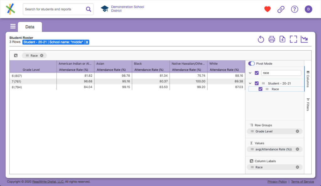
Using the mouse, grab the Race column label in the tool panel and drag it into the Column Labels box at the bottom of the tool panel. Assuming you have some variety in your race makeup, you’ll something like this:
Is that your first pivot table, ever? Party time…
Now that you have it, let’s talk about what we see. The column labels, which before was just a single “Attendance Rate (%)” has been broken down into one column for each race category in our data and labeled with that race data. So now we have “Asian Attendance Rate (%)”, “Black Attendance Rate (%)” and so on. This means we have answered for a 4th category of our (now) 5 categories of data question. The fancy word for this display of data is disaggregation or more simply put, we are looking at data by subgroups. The magic of Analytics is it formulates these subgroup breakdowns and calculations on command in a microsecond. Doing this manually would otherwise take hours, even days, when you consider the time it takes to manually collect, match, scrub, organize, calculate, correct and calculate again.
A pivot in a pivot: nested pivots
Just when you thought it was safe to claim victory, there is one last category of data to solve for in our question: ethnic group. Back to the tool panel, start typing “ethnicity” in the search box, you’ll see this:
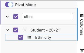
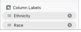
We are going to pivot on Ethnicity and Race. Since Race is already in the list of Column Labels, just drag the Ethnicity column down to that section of the tool panel and drop it on top of the Race column. Drag the columns around so Ethnicity shows up first followed by Race, like so:
With that, you should see your data view transformed into something like this:
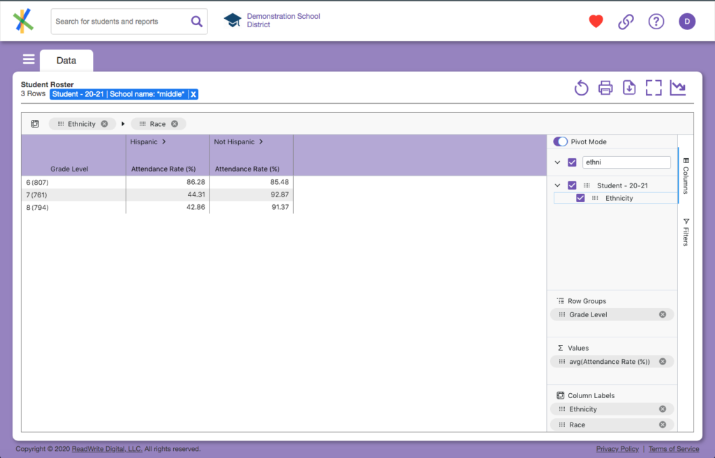
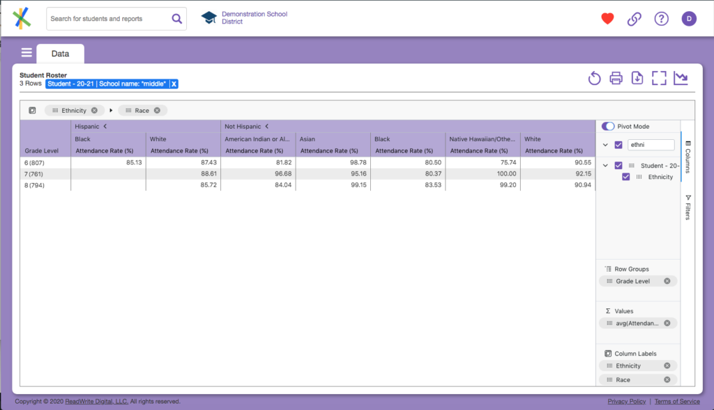
You now see Ethnic group categories (“Hispanic” and “Not Hispanic”) and their aggregations by grade, but what happened to the Race? The chevrons in the column headers next to the “Hispanic” and “Not Hispanic” tell you there is more to see. Click them, and you’ll see something like this:
Proper pivot placement
Just like the decision about what we should and should not group on as discussed in the section Summarize data with groups and charts, you will want to give some thought to the types of columns you want to pivot on. The good news is the principals are very similar. When you pivot on a column, a synthetic column is created for each unique data element in the pivot column. This means you again want columns with a low cardinality of data. For example, you would almost never want to pivot on something like Student Number. The only exception to that might be if you know you are dealing with a very small number of students due to filtering. Columns with generally small finite variation in data are ideal as pivot columns. Therefore: race, ethnicity, SWD, ELL, Gender, even grade level are all great candidates as pivot columns in most scenarios.
Previous: Summarize data with groups and charts