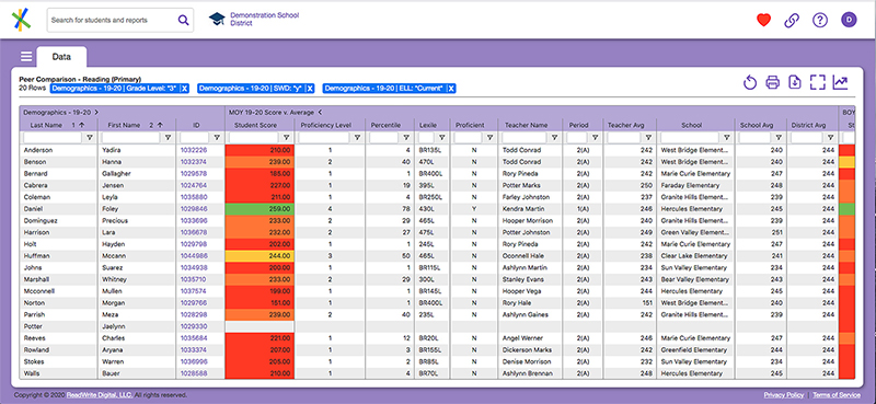
Data views (some might call them “reports”) are central to the functions of ReadWrite Digital Analytics. This section tells you everything you need to know about them. If you want to save the data view you’ve worked on, remember to save it as a favorite.
In this section
Working with data views
Types of data views
Configure a view with column format and display
Find and organize data with filter and sort
Reset, print, download and expand data views
Saving your work with favorites
Sharing your work with link sharing
It’s a live view, not a static report
We use the term data views because the data presented in ReadWrite Digital Analytics is live and constantly updated. This in stark contrast to “reports” which typically present static data and come out of traditional decision support tools. In reality, even reporting systems have their data updated but those updates are often so old, the data is useless by the time educators see it. Presenting timely and actionable data in a familiar way is a key feature of ReadWrite Digital Analytics. Educators understand the benefit of knowing your student is struggling with algebraic equations now versus 6 weeks ago. Want a static report to represent a point in time? Easy enough. Print or download any view and voila!

Data view layout and organization
Presenting a student’s performance over time and relative to their peers in a consistent and easy to use format is one of the key features of ReadWrite Digital Analytics data views. Here are few things to know about how that is done:
- Column block header with sub-heads. Data views can have a lot of data. So much that, without some way to manage what you are looking at, it can become overwhelming. Enter the block header. Data view headers typically occupy two rows of text. For example:
Here the “block header” is MOY 20-21 Score v. Average telling you the data within that block all pertains to the middle of year student score compared to averages for the 2020-2021 school year. The right facing chevron is an indicator there are more columns in the block. Click it to “open” the block and show the additional columns. To “close” the block, click the chevron again which now looks like this
.
- Color coding aligned for key data points. Scores, grades, attendance rates, suspensions, etc. all represent key information about a student. Selected data points are color coded on a scale and color coding system as defined by your organization. However, the color and performance scale is aligned such that it is consistent across all types of data for the organization. For example, the same color used to indicate a student is at Threshold performance for an interim assessment will also be used to indicate they are at Threshold for an attendance measure. This allows you to quickly discern patterns of performance for a student or group of students.
- Subject area aligned scores. When possible, grade and score data are mapped to subject areas as defined by the National Center of Education Statistics School Courses for the Exchange of Data (SCED) system. For example, math is a subject area and when a student’s 8th grade math, 9th grade algebra and 10th grade geometry performance is laid out across three years of a data view, the idea is to have all of those scores on one row aligned to the subject area of math. Sometimes a student will have more than one row for the same subject area especially if they have taken more than one course in that subject area during the same term. Still, allowing you to group these performance measures together provides a quick visualization of performance and growth.
- Column header controls. To keep data views uncluttered, certain controls used to manipulate data views are not always visible. Hover your mouse over a column to see it’s menu control. From there you can control column format, display and filtering as described in other sections.

Next Page Link: Types of data views